Project Pool Party
UX Designer Generalist
1 week - July 2025 | Remote
Figma | Canva | Unsplash
Project Overview

Problem Statement: Users lack a fun and engaging platform to collaboratively save money with friends or family toward a shared goal. Currently, there are limited solutions that allow multiple users to contribute to a single savings pool—whether for a vacation, home, or emergency fund
Goal: Develop an enjoyable, user-centric website that facilitates easy and the creation of saving pools.
User Research
Non-monitored surveys | Interviews
Saving Pain Points:
I conducted user research by surveying family and friends with a custom budgeting questionnaire.
The responses revealed that while many individuals are actively saving, often with a partner or group, they typically rely on informal tools like Notes apps or Excel rather than dedicated budgeting platforms. This insight highlighted a clear opportunity: a need for a fun, collaborative, and easy-to-use budgeting website that supports shared financial goals. These findings directly shaped the design and functionality of my final product.


User Persona

Problem statement:
Susan is a Mother who needs family Budget app/website because the Johnson Family wants to save for a vacation
User Journey Map

Need to ensure that Susan is able to create a budget and vacation savings pool for her friends and family.
Design Journey

Made sure the map is user-friendly and easy for anyone to navigate and utilize.
Sitemap


Paper Wireframes
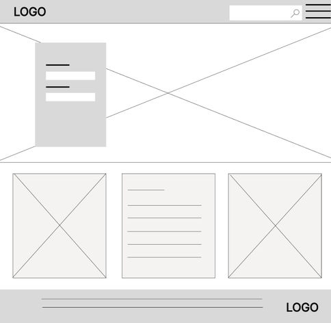
I explored various design options for my pages and quickly determined what would be effective or ineffective.

Transformed my paper wireframes to solve real user pain problems. Ensuring to keep in mind pain points that my research uncovered.
Easily see an adaptive budget that is custom to user
Add Friends easily and make saving more social
Digital Wireframes
Usability Study
Non-monitored surveys | Interviews
The Home page did not make sense. Felt too much like a profile page
Where would the pool button lead if the user has more than one saving pool.
Where would the pool button lead if the user has more than one saving pool.
Can we have reoccurring options for when building the budget, especially with subscriptions
Mockups - Post Usability Studies
Simplified the homepage to function as a landing and login screen. The original design felt more like a profile page, which made the actual profile page feel redundant.
While navigating the Budget page, it was observed that Susan had multiple pools, but clicking on "pool" did not clearly indicate where it was leading. To improve usability, I removed the button and replaced it with one that instead can be used for creating a new pool.
Users expressed interest in the ability to mark budget items as recurring. To address this, a checkbox was added to the budget section, allowing users to indicate recurring charges that will auto-populate in future entries.
Results
Designed and prototyped a successful website for the Pool Party team, incorporating feedback to ensure a seamless, developer-ready product.


Final Thoughts:
Skills
-
User Research
-
Wireframing
-
Prototyping
-
Visual Design
-
Interaction Design
-
Information Architecture
-
Usability Testing
-
Accessibility Design
-
Canva
-
Figma
-
User Flow Mapping
-
Problem Solving
-
Design Iteration
-
UI Design
-
Feedback Integration
-
Affinity Mapping
-
Persona Development
-
Task Flows
-
Brand Design Toolbox
Next Time:
Testing is essential—again and again. Just because a design works early on doesn’t mean it will continue to work as more components are added. UX design is like a puzzle: each piece must fit together to create a cohesive whole. You can never test too much, and testing should be done consistently throughout the process.
If I were to do it again, I’d broaden my user survey group. Gathering a wider range of perspectives would help ensure the product is truly accessible and inclusive for all users.
I also learned the importance of attention to detail. Every element—no matter how small—matters. Even the tiniest button should make sense within the overall design. When something feels off, it's always better to seek feedback from other designers or do additional research rather than rely on quick fixes or assumptions.
Overall, this project was a valuable learning experience. I had the opportunity to design a product from start to finish, applying the full UX process from research to final prototype.


